*This project was made in partnership with the talented team at swt.co
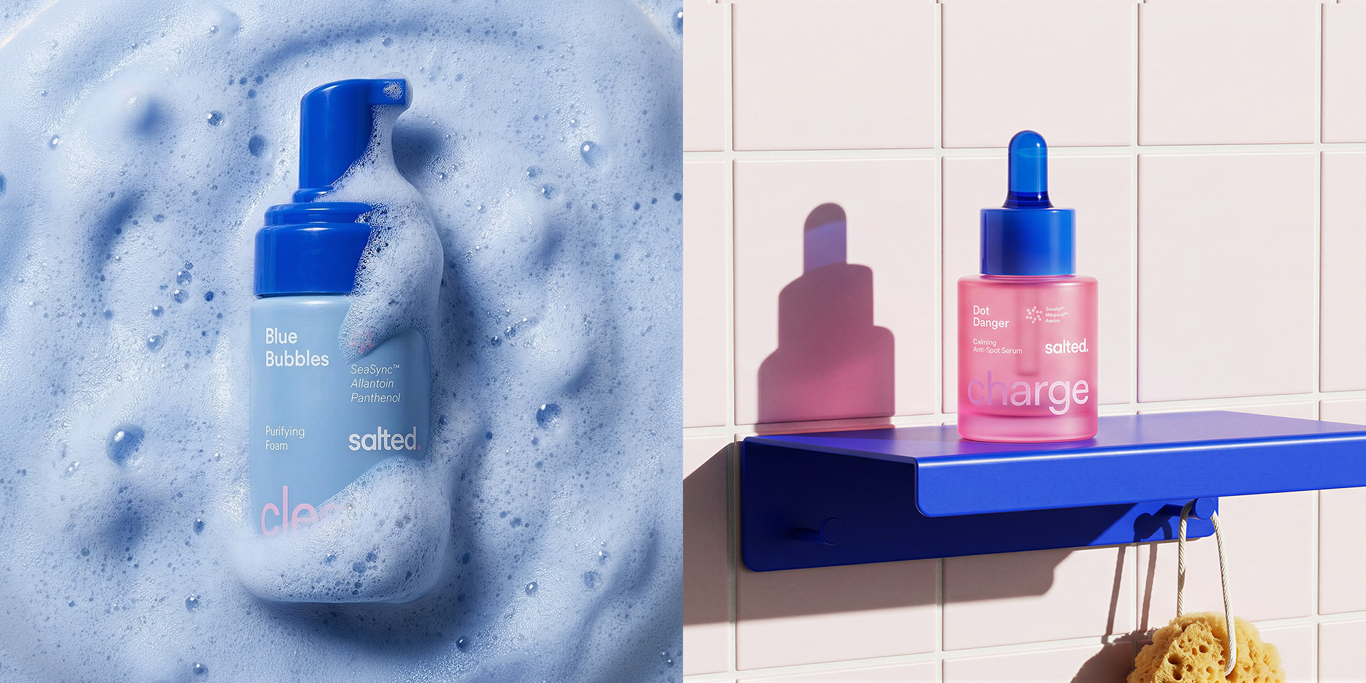
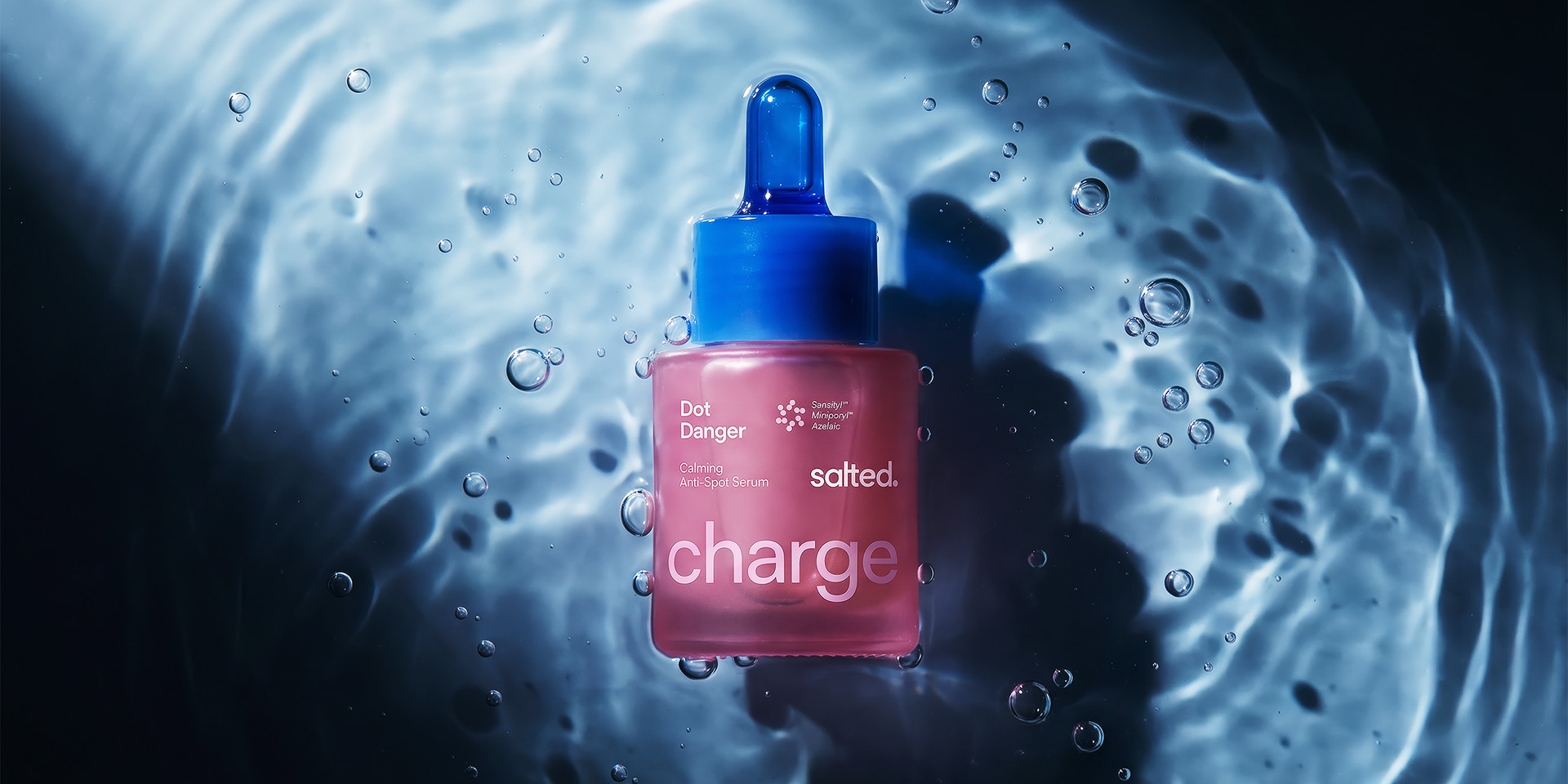
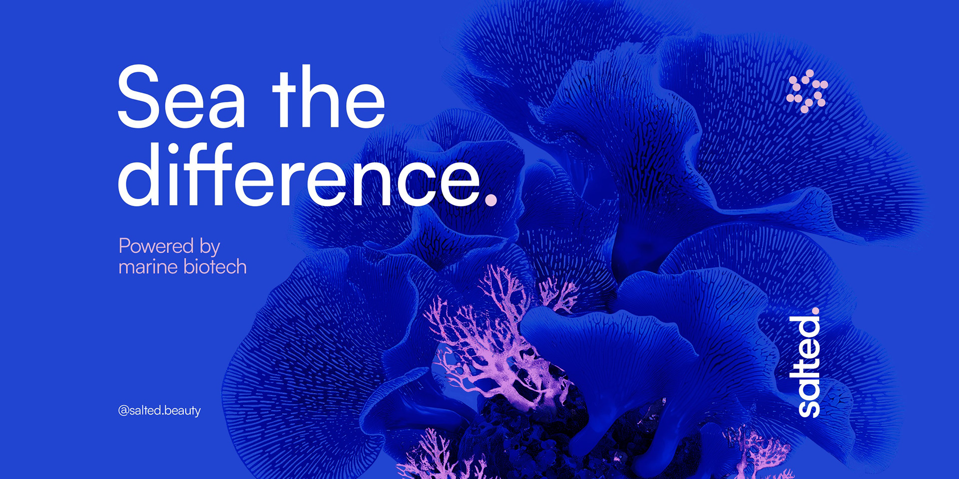
The ocean defines the system. It represents origin, balance, and constant movement. A natural environment where elements coexist in equilibrium. Salted translates this logic into a visual and packaging system that feels both controlled and fluid. This tension between precision and movement guides the entire project.
Approach
The work focused on refinement and alignment. Information hierarchy was clarified, layouts were reorganized, and the visual language was adjusted to create a more cohesive system. At the same time, the ocean was brought forward as a central narrative element, connecting product, formulation, and image. The result is a system that feels clearer, more structured, and more intentional.
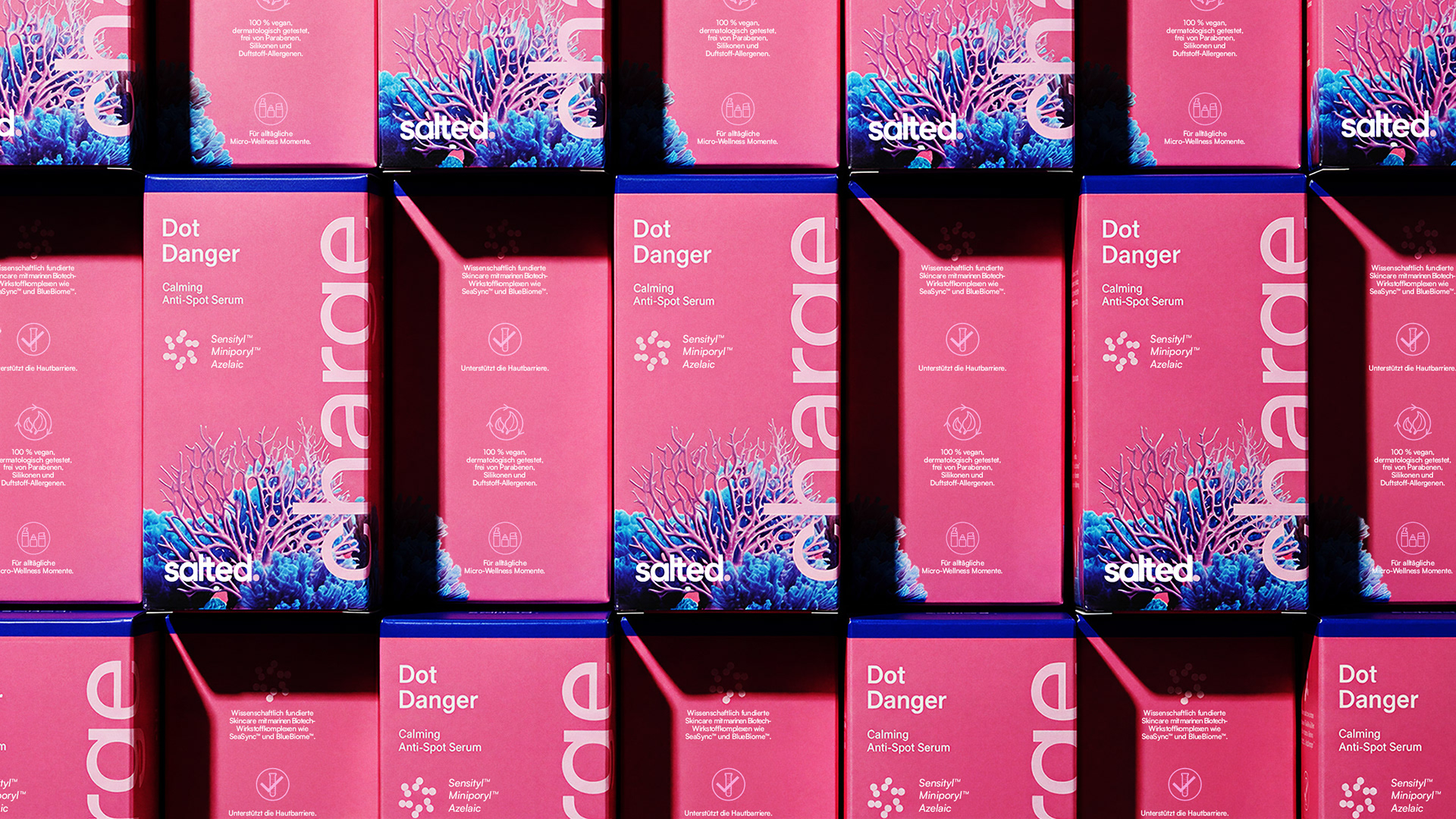
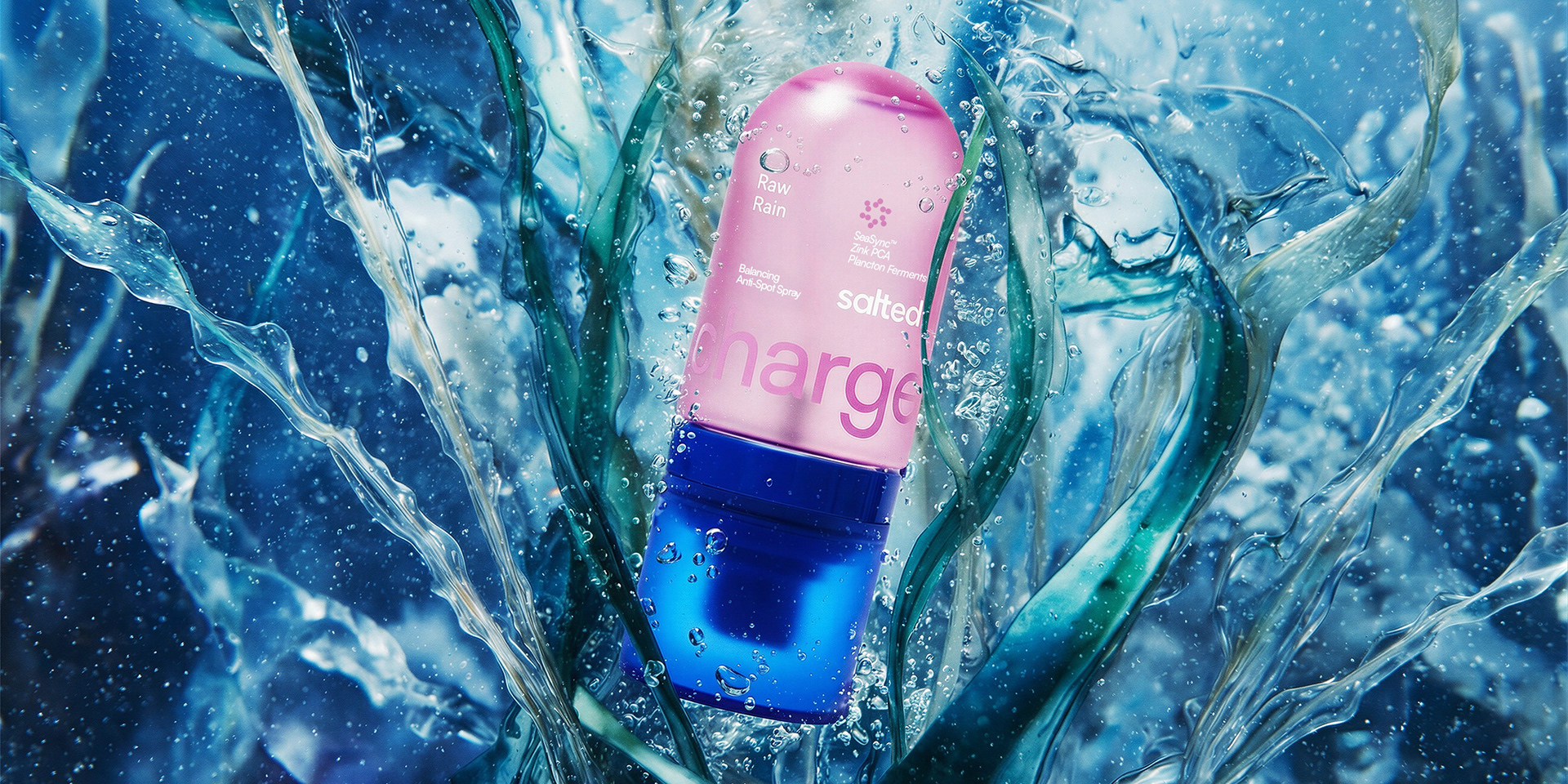
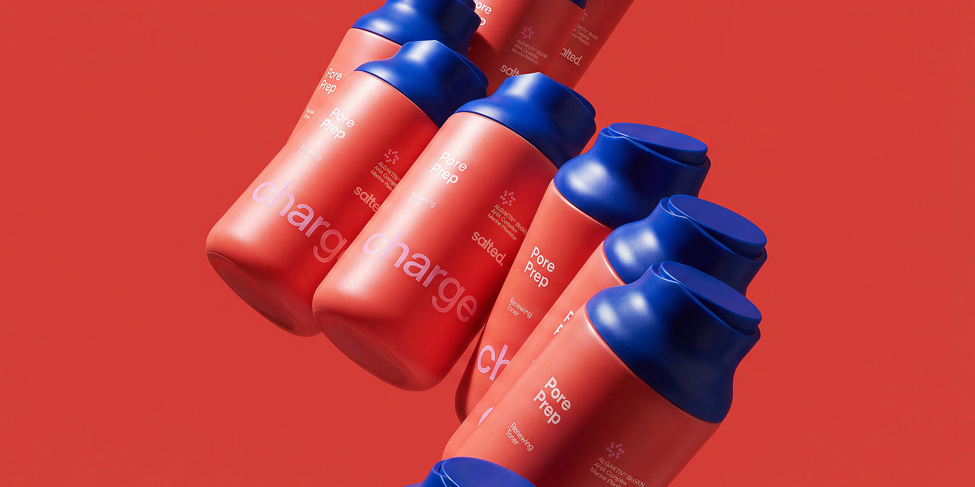
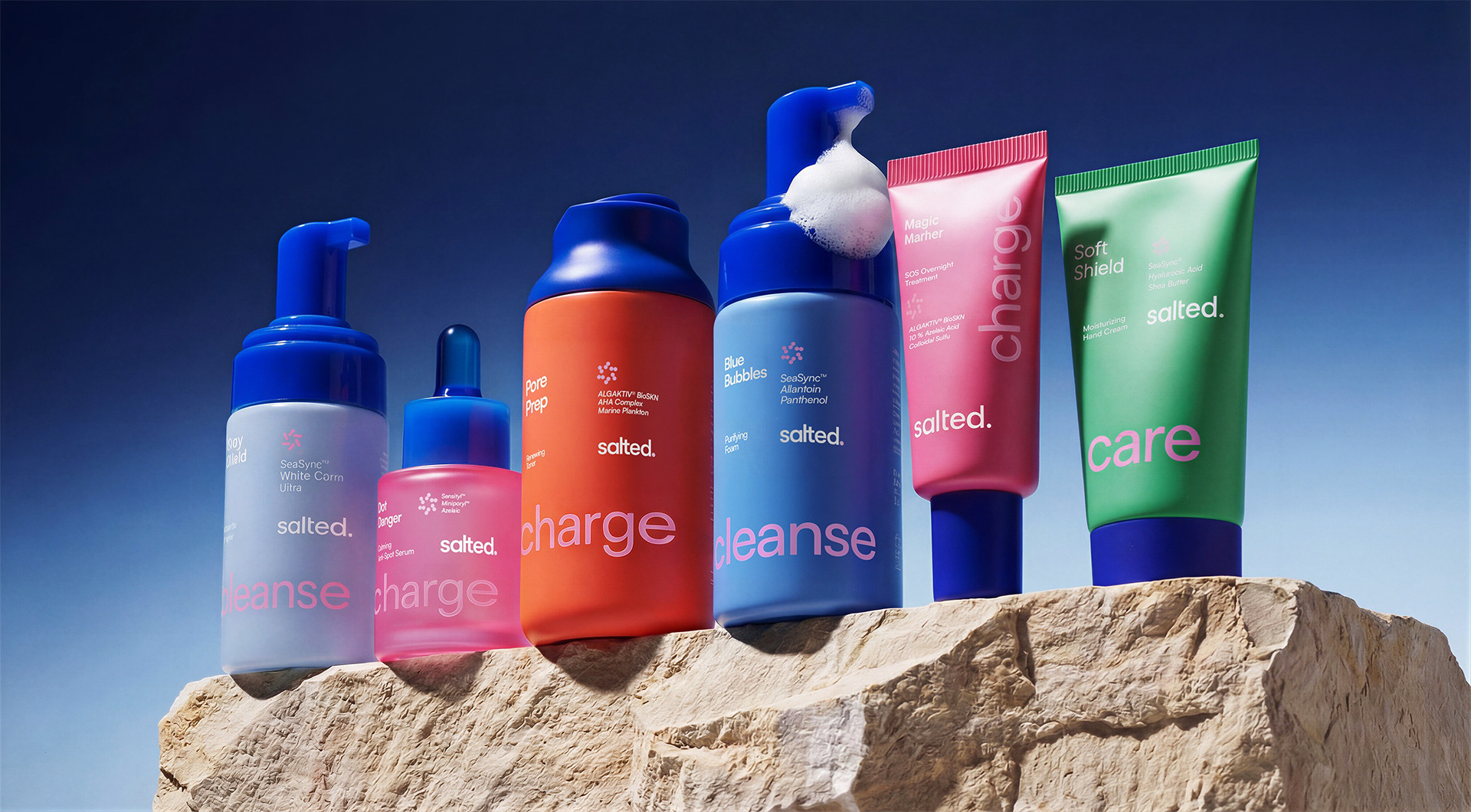
The packaging was redesigned to improve readability and consistency. Typography establishes a clear hierarchy, allowing key information to stand out while supporting details remain accessible. Proportions and layouts were standardized across formats, creating visual coherence throughout the range. Each product communicates more directly, reinforcing both usability and shelf presence.

Color is rooted in the logic of coral reefs. Corals represent one of the most vibrant and diverse systems within the ocean, where color is not decorative but functional, signaling life, variation, and adaptation. Salted translates this principle into its palette. Deep blues create a stable foundation, evoking water and depth. Coral tones introduce contrast, vitality, and differentiation across the range. Neutrals provide balance and breathing space. Color becomes a structural tool, guiding navigation, distinguishing products, and reinforcing the connection between marine origin and skin vitality.